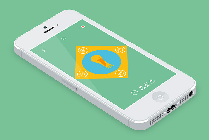


To accompany the wall chart I designed a Brazil 2014 app. Content, reflective of the design style, had to be simplified and streamlined allowing users to access only the need-to-know information without overly complex navigation.
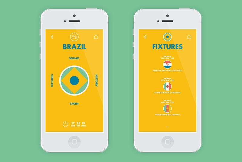
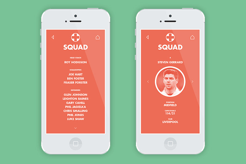
The idea is that from the home screen the user can swipe either up, down, left or right to take them to any of the four key information areas; Calendar, News, Groups and Teams respectively. This navigation method is incorporated into the structure of the reduced Brazilian flag, a theme which is consistent throughout the project.