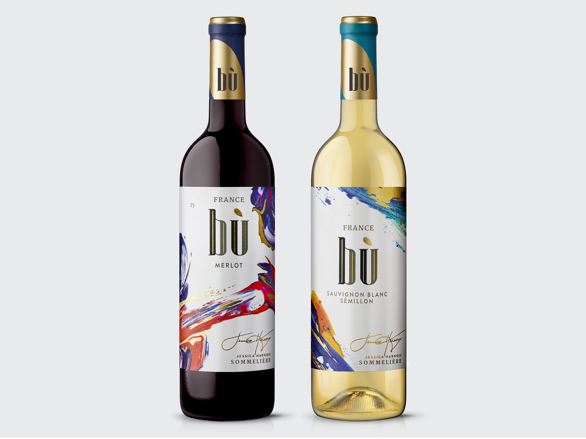
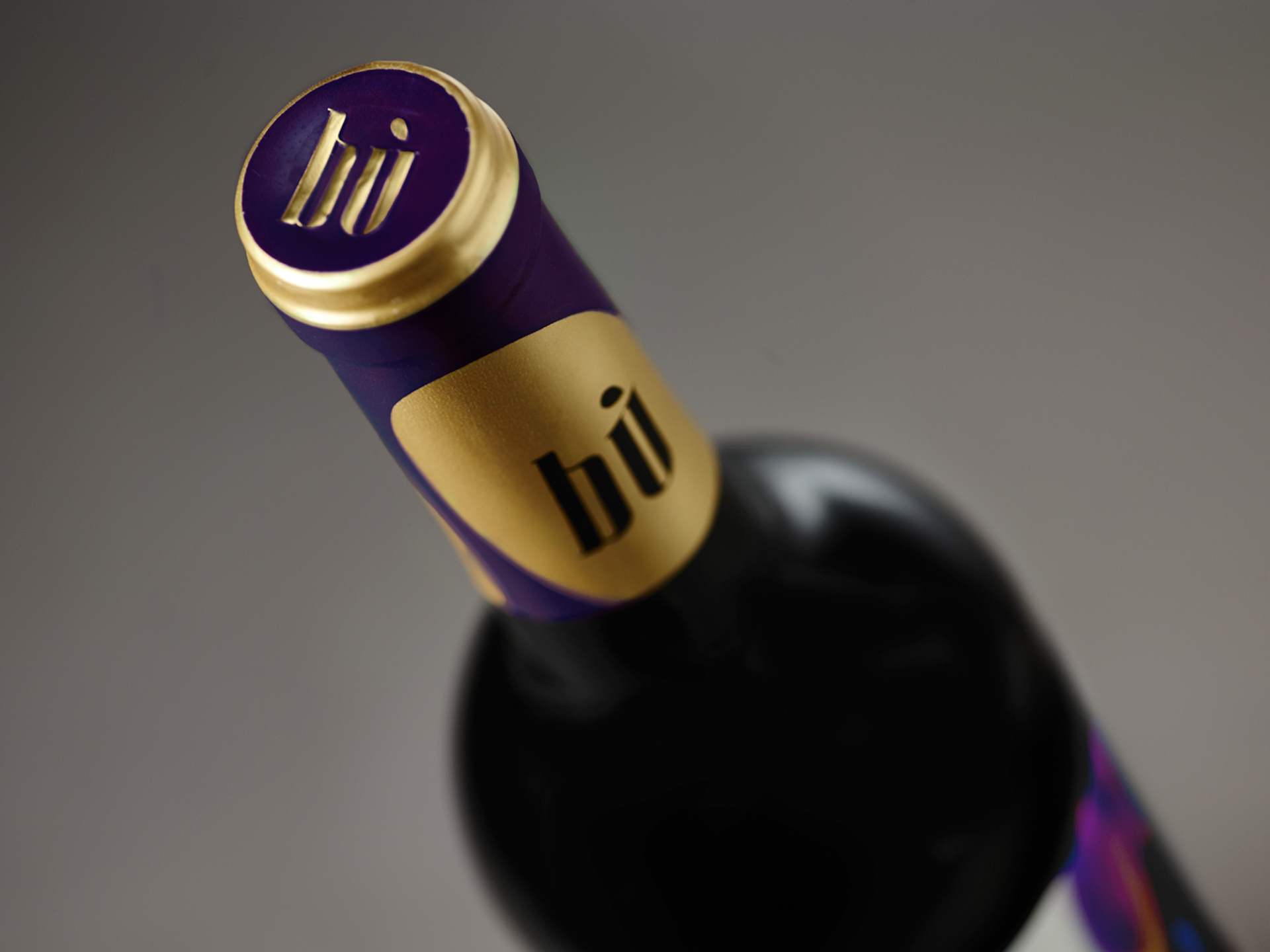
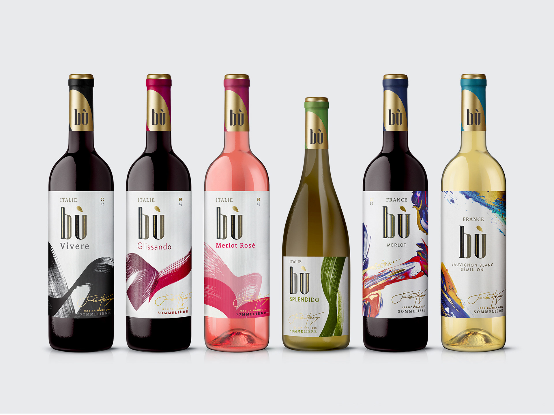
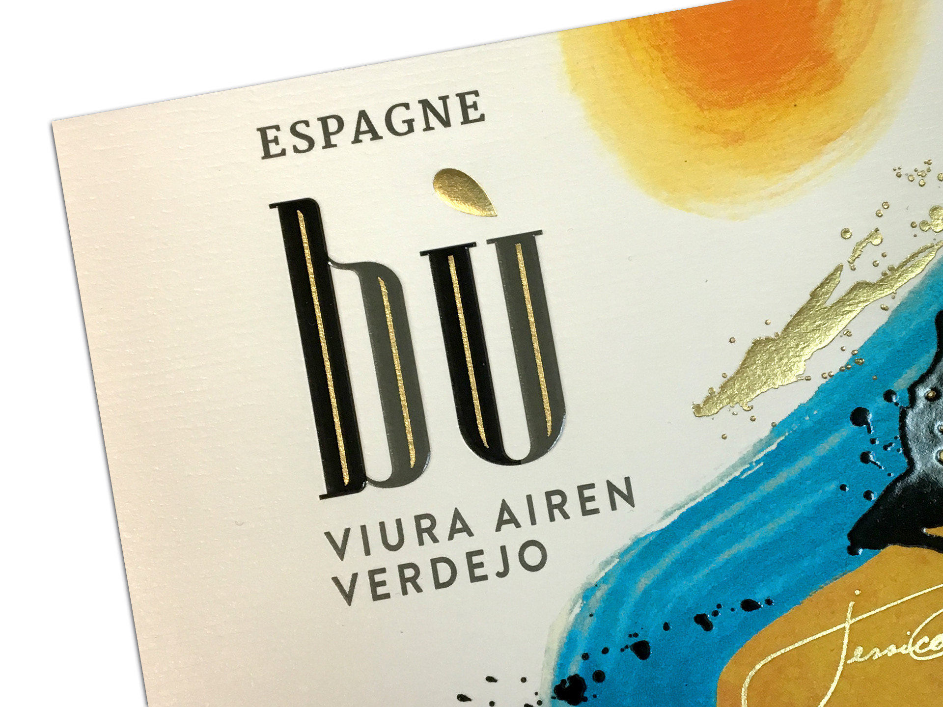
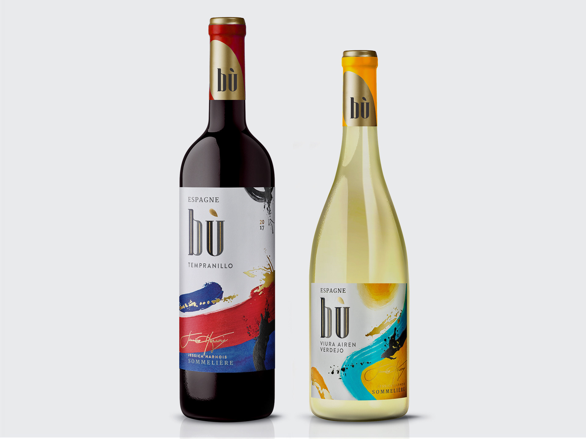
Bù is a line of sommelier-selected wines developed to reinvigorate the Quebec grocery channel and build a healthy portfolio mix for Vins Arterra Canada.
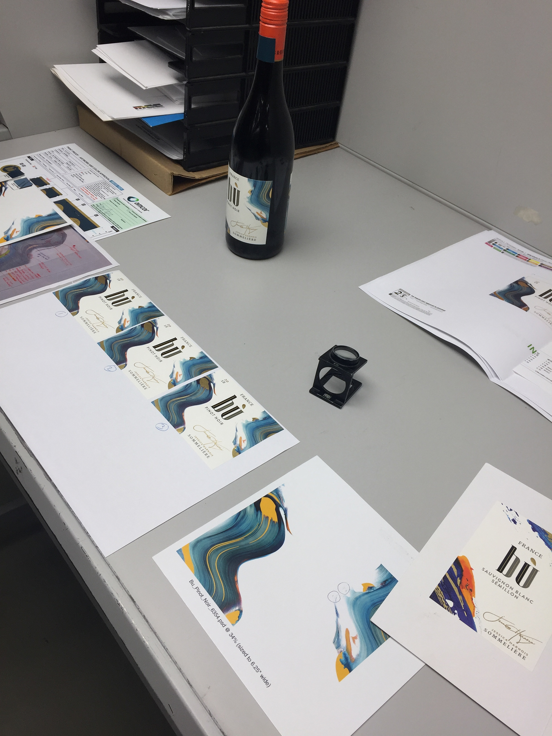
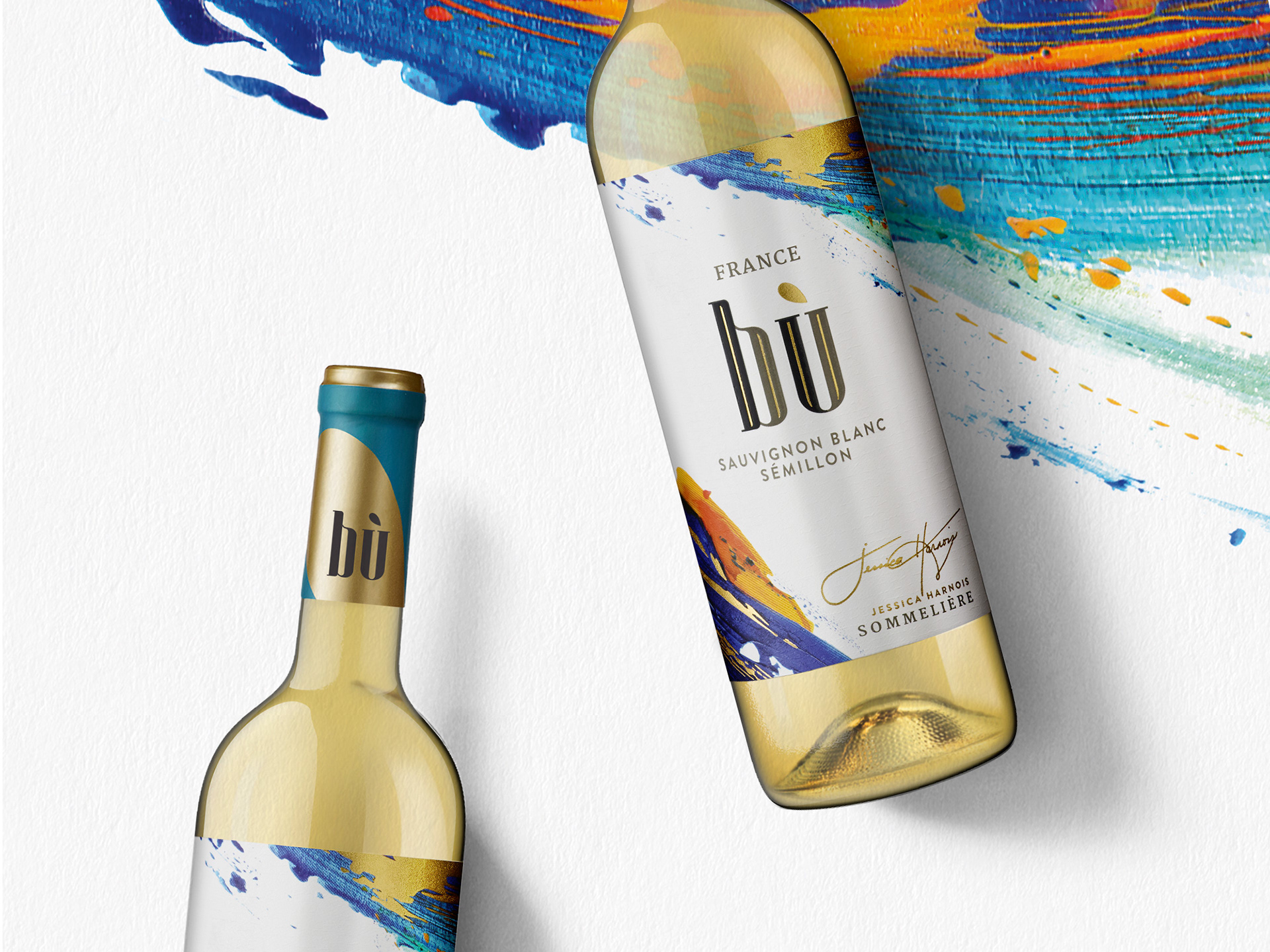
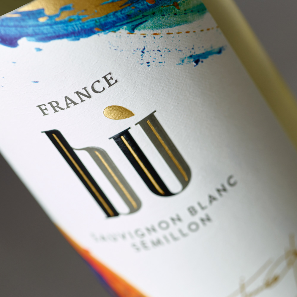
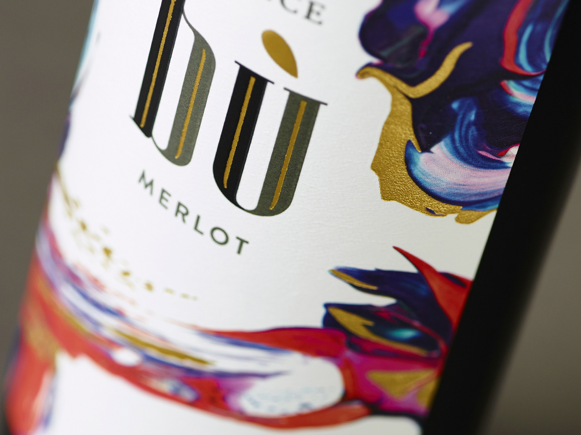
With the Italian series already in market, we were challenged with developing designs for two new French Varietals. They were to use the paintbrush theme to tie in cohesively with the existing Bù brand products but be unique enough that they were identifiable as a new series from a different country.
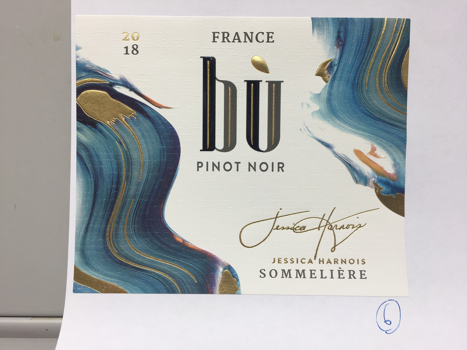
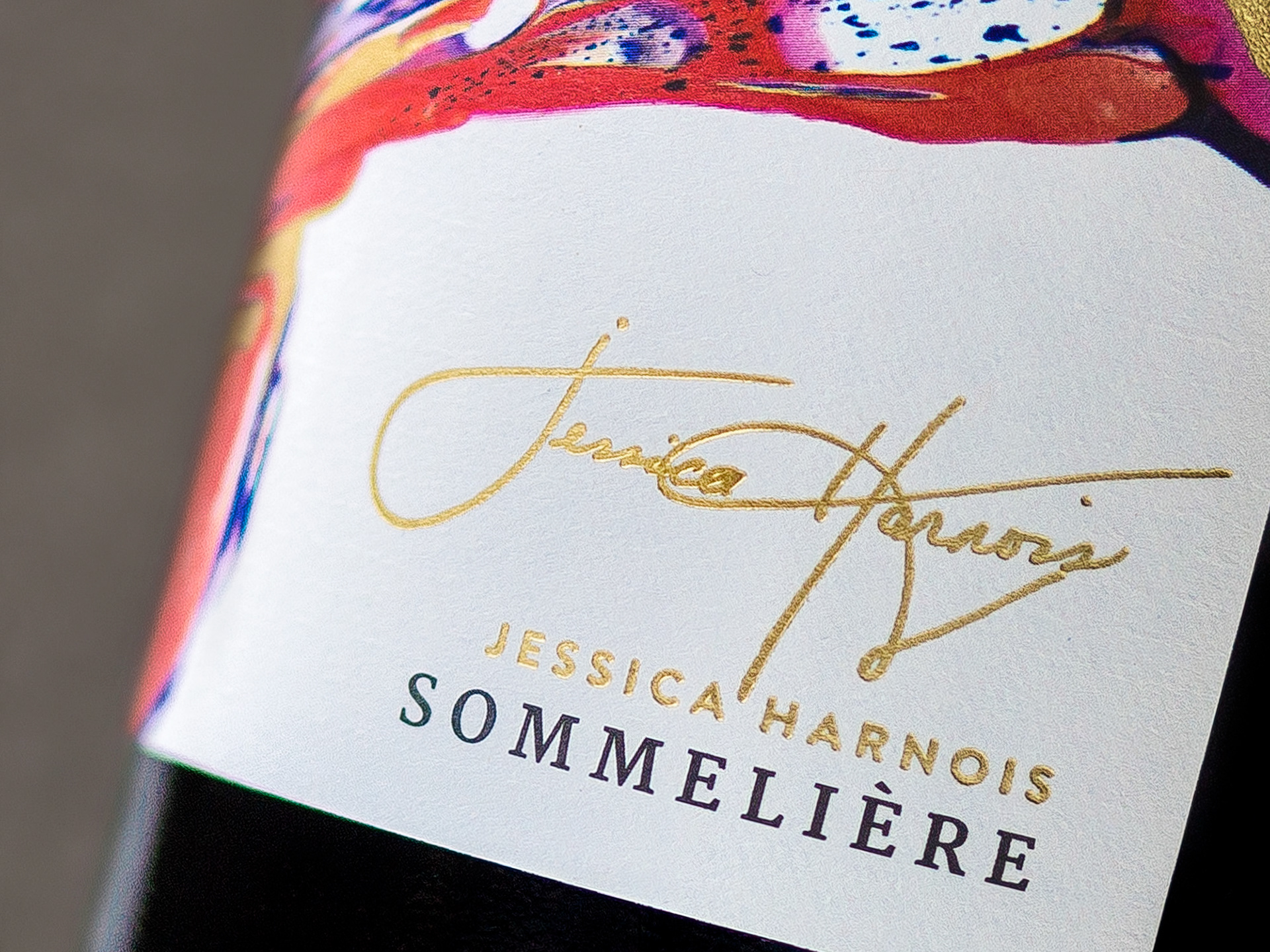
I devised a creative strategy that evoked french wine culture and from there, we sourced and commissioned illustrator Jack Vanzet and led the art direction for each label’s beautifully abstract visual.
With each illustration we sought to capture of each region’s winemaking, as well as represent the dynamic character of the distinct wine.
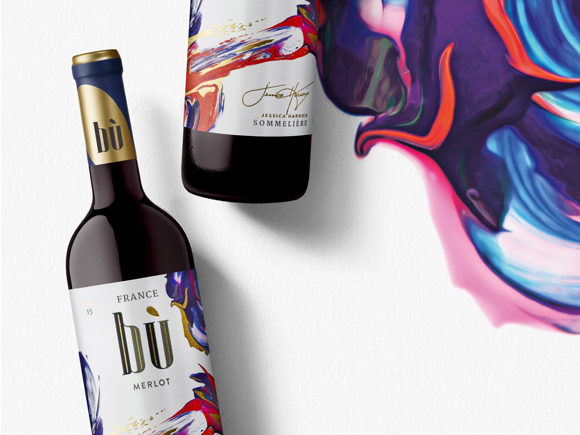
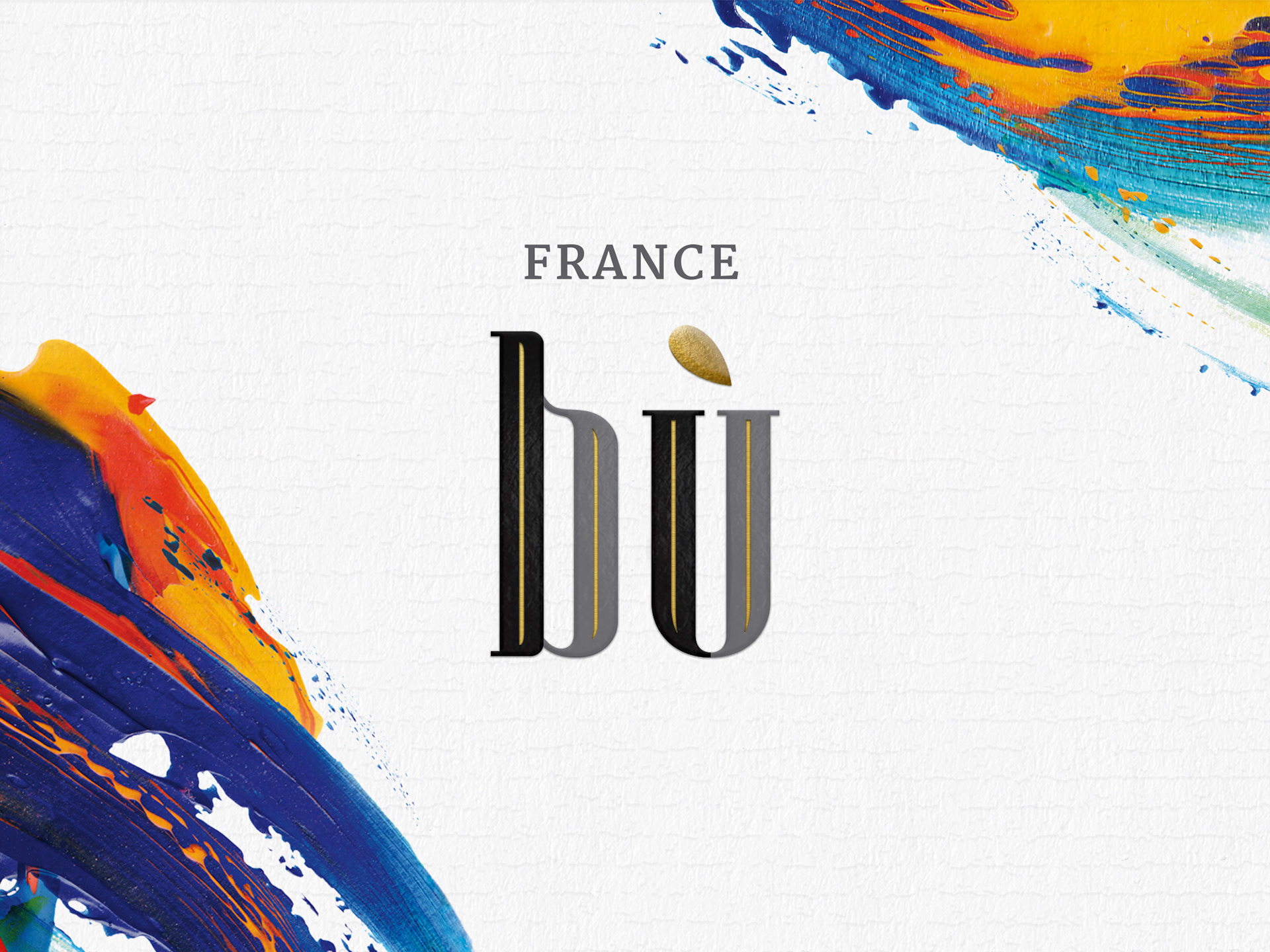
From the unique abstract illustrations to the classic word mark, this premium, multiple-channel wine collection embodies an approachable elegance in artistry, textures, colours and shapes to engage consumers looking for boutique flair on mainstream shelves.
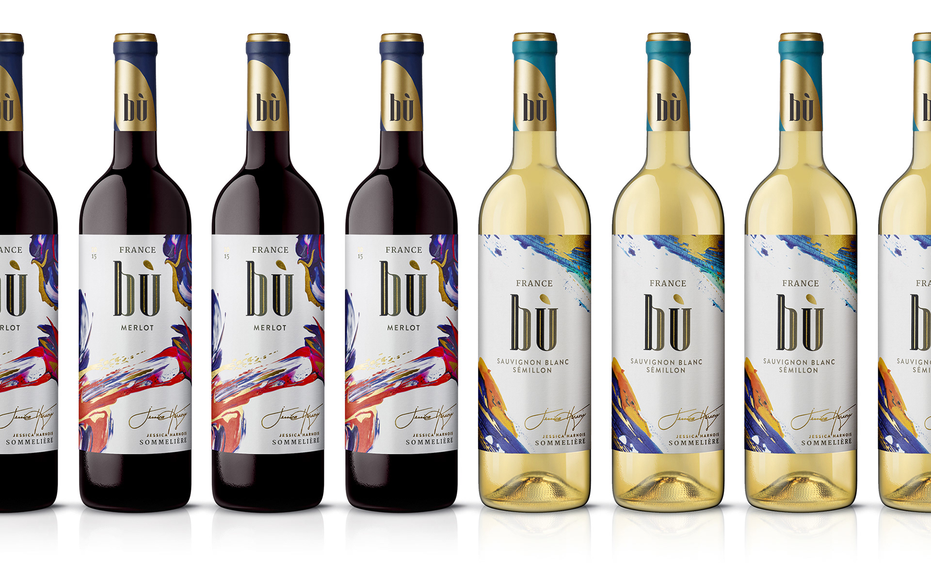
With sales outpacing expectations upon launch, it quickly became obvious that Bù had great potential to be not only a regional Quebec brand, but a successful brand nation-wide.
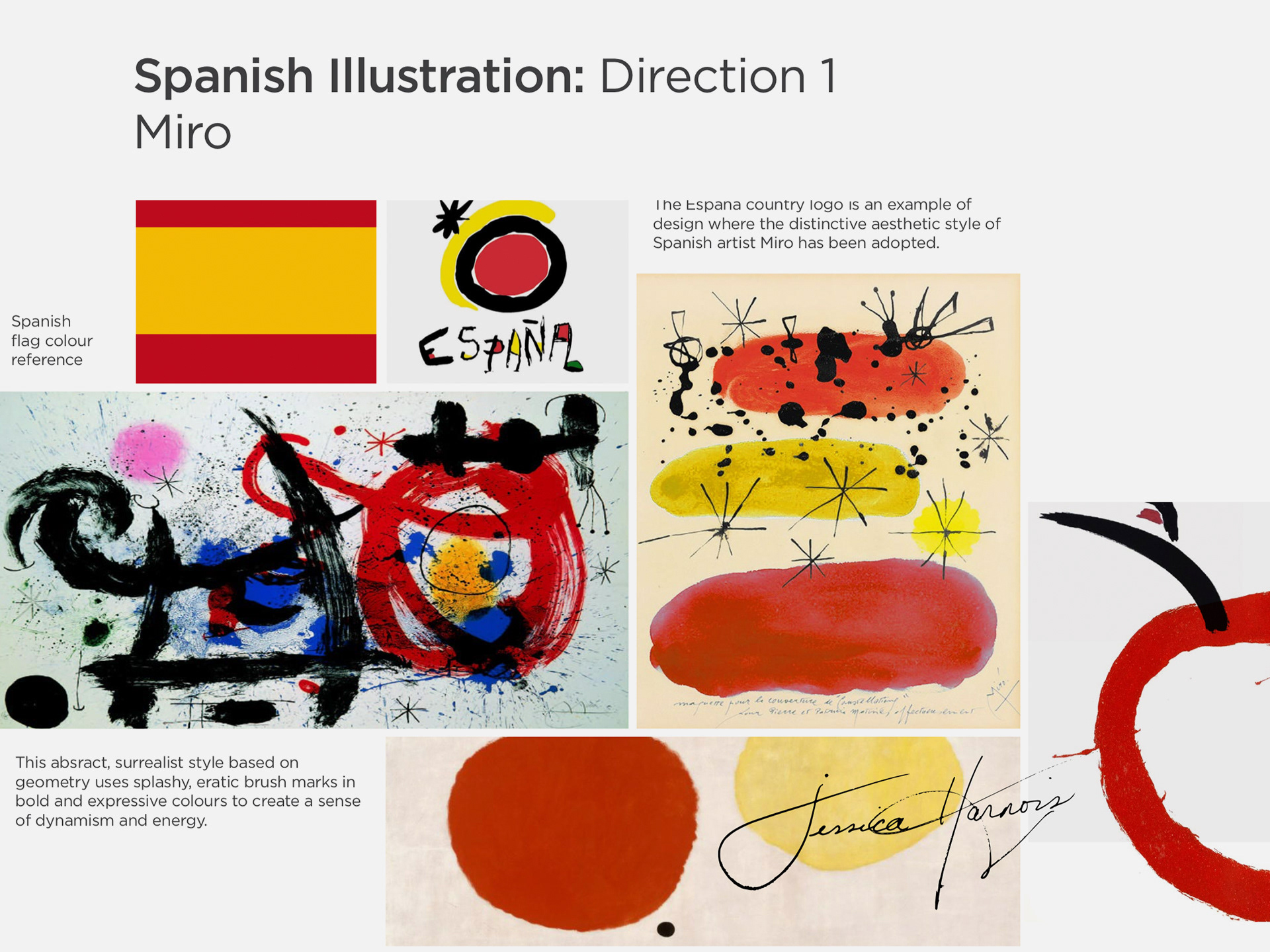
Following the success of Bu France, we were challenged with creating line extensions for Spanish varietals. The approach to the project and process was much the same - but using a different illustrator to create work evocative of Spain and, more specifically, Jean Miro - the aesthetic direction developed during the creative strategy.

I'm currently working on additional line extensions in the Dossier Studio - on shelves in Quebec soon...